Breakpoint - A Handy Tool to Find the Break Points of Your Responsive Websites
Breakpoint is a handy tool that can be used to find the break points of your responsive websites. The tool is compatible with most of the modern browsers and can be used in a keyboard-friendly way.
It is a perfect companion when you are trying to find the exact pixel where your responsive websites break. You can use it as an easy way to make sure that your site is fully responsive and can be used on all devices.
The tool can be used in two different ways. You can use it in the default settings, which are suitable for most websites. You can also change the settings to make it more versatile.
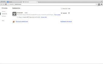
The first thing you need to do is to install the extension. After the installation, you will be able to use it in the browser. The first step is to open the browser. You need to make sure that you are in the default settings.
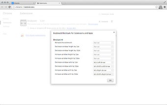
If you want to use the tool, you need to press the Alt + Left Arrow key. You will find this key in the bottom-left corner of the keyboard.